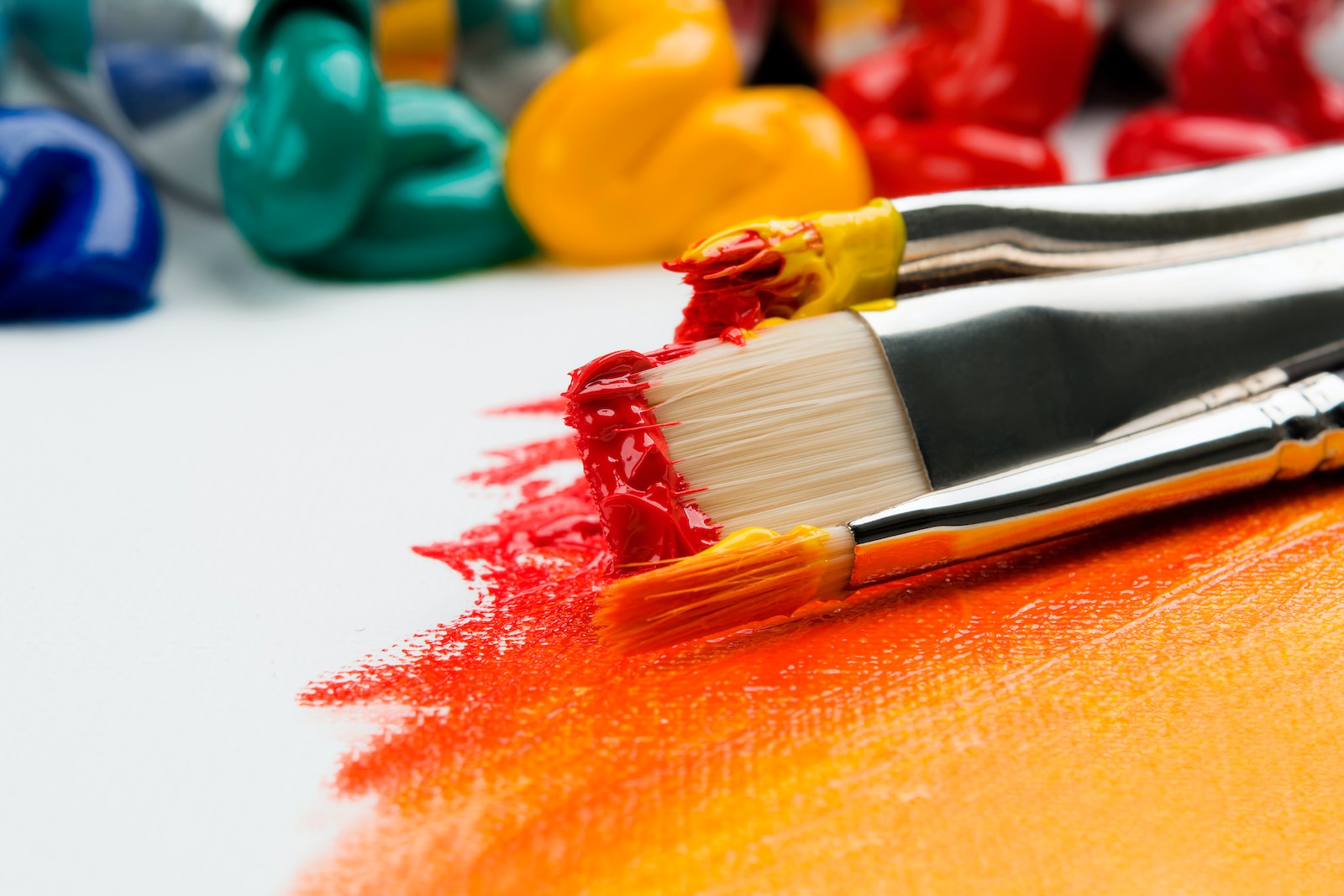
Color is a powerful tool in design, art, and visual communication. Understanding the concept of complementary colors can help you create eye-catching combinations that enhance the impact of your work.
Which are the compatible colors?
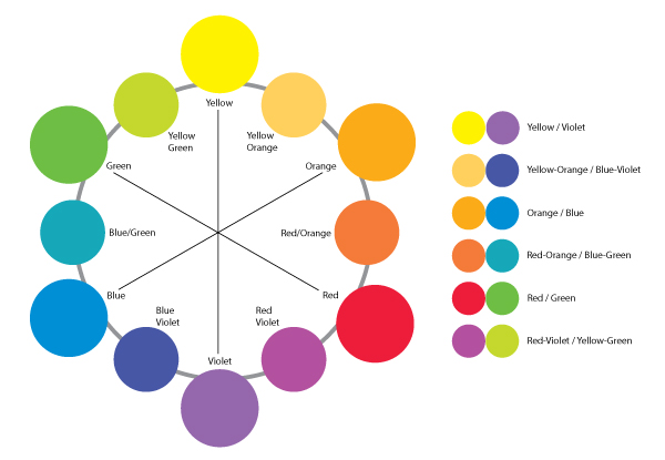
Complementary colors are pairs of hues that, when placed together, create a strong visual contrast and harmony. In this article, we will explore 20 stunning examples of complementary color combinations that can inspire your creative endeavors.
1. Blue and Orange
One of the most well-known complementary color pairs, blue and orange, creates a striking contrast. The coolness of blue complements the warmth of orange, making it perfect for attention-grabbing designs.
2. Yellow and Purple
Yellow and purple form an energetic combination that exudes creativity. The brightness of yellow pops against the richness of purple, creating a visually captivating contrast.
3. Red and Green
Red and green are classic complementary colors, often associated with the holiday season. The intense vibrancy of red pairs beautifully with the refreshing and natural appeal of green.
4. Teal and Coral


Teal, a blend of blue and green, finds a perfect match in the warm and lively tones of coral. This vibrant duo creates a sense of energy and excitement.
5. Orange and Turquoise
The cheerful and warm nature of the orange pairs beautifully with the refreshing and cool hues of turquoise. This combination is often used in tropical and beach-themed patterns.
6. Pink and Green
The delicate, feminine charm of pink balances wonderfully with the freshness of green. This combination is often used in floral and spring-themed designs, creating a harmonious and calming effect.
7. Red and Cyan


Red and cyan create a high-contrast and dynamic pairing. The intensity of red pops against the coolness of cyan, resulting in a visually stimulating and captivating combination.
8. Blue and Yellow
Blue and yellow represent a contrasting blend of coolness and warmth. This classic combination is both visually pleasing and attention-grabbing, making it versatile for a wide range of applications.
9. Green and Magenta
The vividness of green harmonizes with the boldness of magenta. This combination is often used in modern and contemporary designs, adding an element of drama and intrigue.
10. Purple and Lime Green
The regal elegance of purple finds an unexpected match in the vibrant and refreshing lime green. This combination adds a modern twist to traditional color schemes.
11. Orange and Indigo


The warmth of orange creates an exciting contrast with the deep and mysterious indigo. This combination is perfect for designs that require a touch of intensity and intrigue.
12. Pink and Blue
The softness of pink beautifully complements the calm and serene tones of blue. This combination is often used to evoke a sense of tranquility and peacefulness.
13. Red-Orange and Blue-Green
The merging of red and orange with blue and green creates a visually engaging and balanced palette. This combination is often associated with vitality and the great outdoors.
14. Maroon and Chartreuse
The deep and rich maroon finds a vibrant and lively match in the bright and acidic chartreuse. This combination adds an element of excitement and energy to any visual.
15. Peach and Mint


The soft and delicate hues of peach harmonize with the cool and soothing tones of mint green. This combination creates a gentle and relaxing appeal.
16. Yellow-Green and Violet
The zesty and refreshing yellow-green pairs beautifully with the regal and luxurious tones of violet. This combination is often used to create a sense of opulence and sophistication.
17. Navy and Coral
The elegance of navy blue pairs wonderfully with the lively and warm tones of coral. This combination exudes sophistication and vibrance, making it ideal for a variety of design applications.
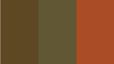
18. Olive and Rust

The earthy and warm tones of olive green blend seamlessly with the rustic and textured hues of rust. This combination adds depth and character to any environment.
19. Aqua and Salmon
The refreshing and tranquil aqua is beautifully complemented by the warm and inviting salmon. This combination creates a sense of balance and harmony, often seen in coastal and summer-themed designs.
20. Mustard and Royal Blue
Mustard yellow and royal blue create a bold and powerful combination. The intensity of the colors makes for a visually striking contrast, often seen in retro and vintage-inspired patterns.
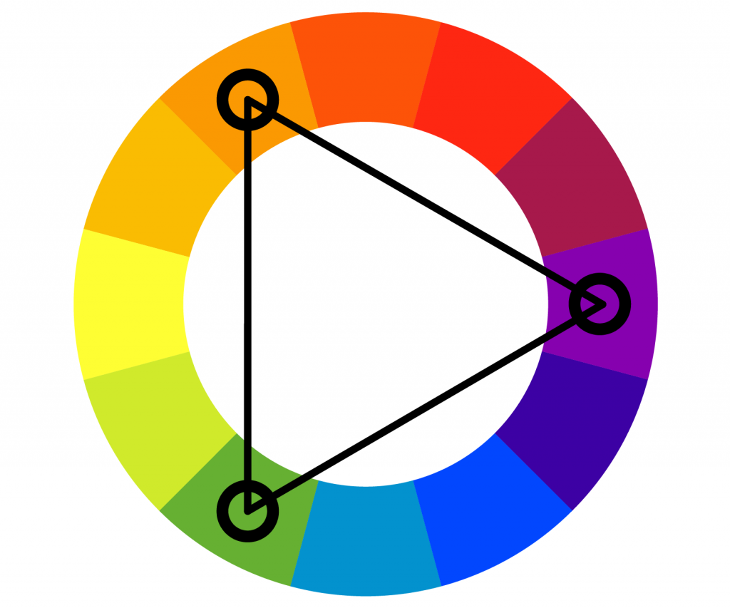
What is a triadic color scheme?
A triadic color scheme involves the use of three colors that are evenly spaced around the color wheel. To create this scheme, you select one color as the dominant hue and then choose two other colors that are equidistant from each other. By using colors that are evenly distributed, a triadic color scheme achieves a balanced and visually striking composition.

Application
One of the defining features of the triadic color scheme is its ability to produce vibrant contrast while maintaining a sense of harmony. This scheme ensures that no two colors overpower or clash with each other, resulting in a visually appealing combination. When selecting colors, it’s essential to consider their relative intensities to create a balanced composition.
An effective way to utilize the triadic color scheme is to designate one color as the dominant hue and use the other two as accents. The dominant color can be applied to the majority of the design, such as a background or large elements, while the accent colors can be used for smaller details, text, or highlights. By using this approach, you can achieve a visually pleasing balance while adding excitement and contrast to your composition.
Examples
- Primary Colors: red, yellow, and blue—form a classic triadic color scheme. This combination is vibrant and visually appealing. For instance, you could use a dominant blue background with red and yellow accents to create a bold and energetic design.
- Secondary Colors: orange, green, and purple—also form a triadic color scheme. Combining these hues allows for a more varied and nuanced palette. For example, you might use a dominant green color for the background, with orange and purple as accents, creating a balanced yet striking composition.
Benefits
- Contrast: By selecting colors that are evenly spaced, you achieve a balanced contrast, enhancing the visual impact of your design.
- Harmonious Balance: The triadic color scheme naturally provides a sense of harmony while offering room for creativity and experimentation.
- Versatility: This color scheme can be applied to various creative endeavors, including graphic design, interior design, fashion, and painting, among others.
- Vibrancy: The use of three distinct colors ensures a lively and dynamic composition, catching the viewer’s attention.
What are split complementary colors?
Split complementary colors are a variation of the complementary color scheme, which is based on the concept of using colors that are opposite each other on the color wheel to create a visually striking contrast. In the split complementary scheme, instead of using just one complementary color, you select a main color and then choose the two colors adjacent to its complementary color.

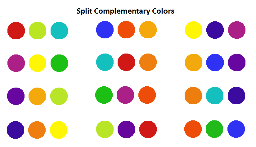
To better understand split complementary colors, let’s consider an example using the primary colors: red, blue, and yellow. If we take blue as the main color, its complementary color would be orange (opposite on the color wheel). In the split complementary scheme, we would select the two colors adjacent to orange, which in this case would be yellow and red. Therefore, the split complementary colors for blue would be orange, yellow, and red.
The split complementary scheme provides a harmonious balance by using colors that are visually pleasing together while still maintaining a strong contrast. It allows for more flexibility and variation compared to a strict complementary scheme. By using the main color and its adjacent colors, you can create a vibrant and balanced color palette for various design purposes, such as graphic design, interior design, or painting.
Examples:
- 1. Main Color: Blue; Split complementary colors: Orange, Yellow, Red
- 2. MC: Green; SCC: Red, Purple, Blue-Purple
- 3. MC: Red; SCC: Blue, Green, Yellow-Green
- 4. MC: Yellow; SCC: Purple, Blue, Green-Blue
- 5. MC: Purple; SCC: Yellow, Green, Blue-Green
- 6. MC: Orange; SCC: Blue, Green, Yellow-Green
- 7. MC: Cyan; SCC: Red, Yellow, Orange-Yellow
- 8. MC: Magenta; SCC: Green, Yellow, Yellow-Green
- 9. MC: Teal; SCC: Orange, Red, Yellow-Orange
- 10. MC: Lime Green; SCC: Red, Violet, Blue-Violet
Relevant Questions
How do you identify triadic colors?
Triadic colors are identified by selecting three colors that are evenly spaced around the color wheel. To find triadic colors, choose a base color, then count three equally spaced segments clockwise or counterclockwise to determine the other two colors.
Why do we use triadic colors?
Unlike analogous colors that make photos look calming and soothing, triadic colors have the effect to uplift the pictures and increase their vibrancy. We mainly use them for creating more contrast while still looking appealing to the eye.
What is a 3 color design principle?
The 3-color design principle refers to a concept in design where a composition is primarily based on the use of three colors. The principle often involves choosing one dominant color that acts as the main focus, a secondary color that supports and complements the dominant color, and an accent color that adds contrast and visual interest.
What is a color-coordinating chart?
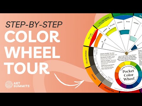
A color coordinating chart, also known as a color coordination or color scheme chart, is a visual tool that helps individuals or designers select and coordinate colors effectively. It typically consists of a grid or wheel that displays different color combinations and their corresponding relationships, such as complementary, analogous, triadic, or monochromatic schemes. The chart provides guidance on which colors work well together and can be used to create visually appealing and harmonious compositions.
What is the difference between split complementary and complementary colors?
The difference between split complementary and complementary colors lies in their composition and visual effect. First, complementary colors are pairs of hues that are directly opposite each other on the color wheel, such as red and green or blue and orange.

On the other hand, split complementary colors emerge when we select one base color and then use the two colors adjacent to its complementary color. For example, if the base color is red, the split complementary scheme might include green-yellow and green-blue.
Which colors are in trend for 2023?
- Sundial
- Tranquil Blue
- Verdigris
- Luscious Red
- Digital Lavender
What is the lucky color and the color of the year 2023?
In 2023, the lucky color is forest green, which symbolizes both the elements of earth and water. The color for the year 2023 is determined by the governing element of the zodiac sign for that year. This auspicious color holds the potential to attract good fortune, wealth, and well-being.
What is the contrast in the color wheel?
Contrasting colors are hues that exhibit dissimilarity. The degree of contrast can range from strong to subtle, determined by their placement on the color wheel. For instance, colors positioned directly opposite each other on the color wheel display the utmost level of contrast, whereas neighboring colors exhibit a lower degree of contrast.
Why is color contrast needed?
Lastly, The significance of color contrast lies in its impact on how individuals engage with content presented in various text and background colors. When there is a lack of contrast, such as low-contrast colors, it becomes challenging to read text that does not sufficiently stand out from the background. Conversely, high-contrast colors facilitate readability, as they create a clear distinction between the text and its background when utilized together. Therefore, color contrast plays a crucial role in determining the legibility and accessibility of written content.