
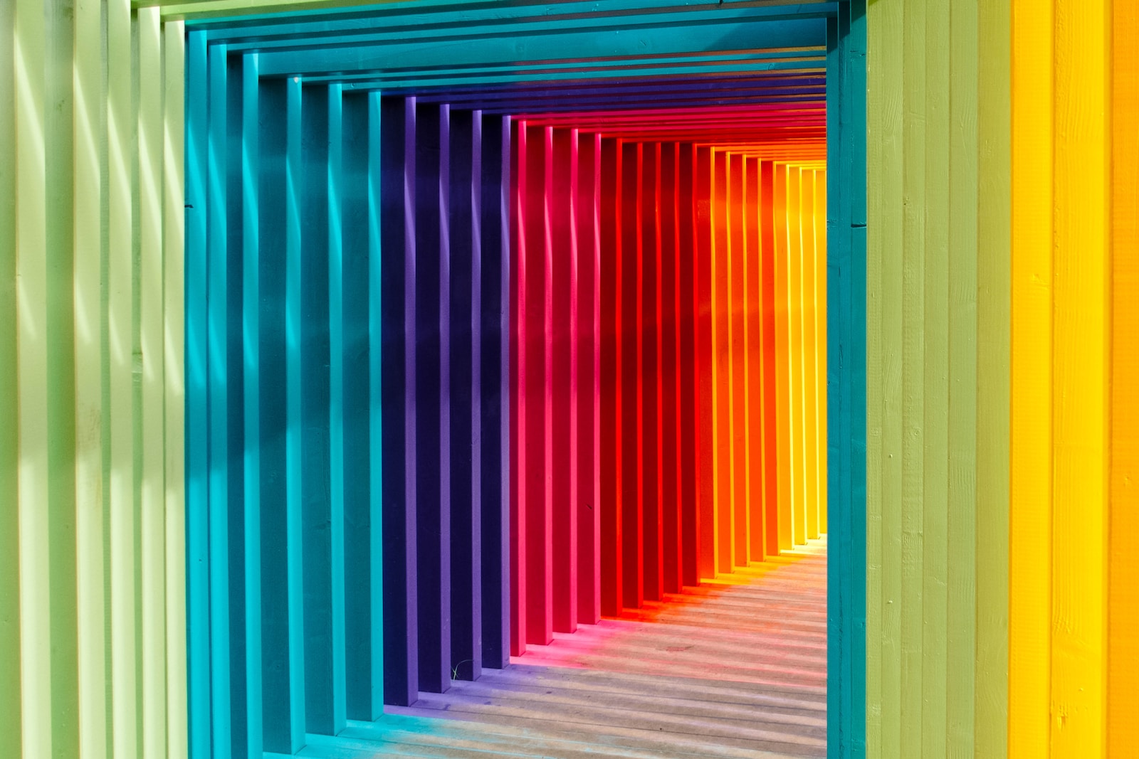
Color psychology studies the impact of various shades and hues on behavior and feelings. Lighter vs. darker, pastel vs. bolder, dull vs. vivid, and natural vs. neon colors can all determine the success or mediocrity of a marketing campaign.
Visuals are crucial in advertising. Companies invest heavily to hire professionals for logo design and website interface. They also hire influencers who align with their brand’s aesthetics and campaign themes.
Smaller brands unfortunately do not have such luxury. There are however, some things anyone with any budget can implement. Here are six ways that using color could change the results of your marketing efforts:
1. Background Color Can Make Displayed Products Seem More Attractive
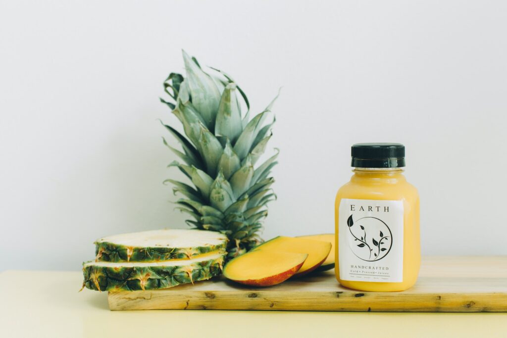
Choosing a flattering background for product photos, like selecting a good background for pictures, can improve sales. In a study, participants evaluated vegetables on various backgrounds.
Results showed that blue and orange were not suitable as backdrops. Black was the best background and had a strong positive impact when combined with carrots due to the high contrast.
This study, which only examined vegetables, can be applied to any product for sale. The background color can either make the product appear dull or make it hard for online shoppers to see the true color. A good match between the product and backdrop can catch attention and make people spend more time checking out the items.
2. Color — or the Lack of It — Can Help People Focus on Different Elements
Color also influences the attributes of an item that people often observe. A team at Ohio State University challenged the widespread belief that displaying products in color is always optimal.
Their study on color psychology involved asking college students to imagine a scenario of going to a remote campsite where they could only hear one radio station. They then saw two possible radios to rent and had to pick the preferred one for such a setting.
The images showed an analog radio available for $10 per day and a digital $18-a-day version with many preset buttons that looked nice but would not help the participants hear more content.
When shown black and white images of radios, 75% chose analog for its practicality. However, when presented with color pictures, half opted for the digital radio, despite its features being useless in the isolated destination.
According to the results and findings of a study, when people view something in black and white, they tend to focus more on the overall shape and purpose rather than the specific details. This is because of how the brain processes information from the environment.
When choosing marketing colors, company representatives should consider the goal of making small buttons and switches stand out. Color images can help achieve this. However, if the product is a basic smart speaker with only one front-facing button, black and white imagery may be the better choice.
3. Colors Can Shape the Characteristics People Use to Identify a Brand
Do you want to increase the likelihood of people associating your brand with particular desirable attributes? Boosting those chances may involve choosing the right colors.
Researchers from the University of Oregon and the University of Cincinnati studied the influence of colors in marketing on people’s perception of eco-friendliness. They presented participants with logos of fictitious companies using colors from popular brands like Walmart, Sam’s Club, and Trader Joe’s.
A study discovered that blue and green are linked to being eco-friendly, with blue being more connected than green. This information can help marketers shape brand identity. For instance, when promoting all-natural ingredients, it’s best to avoid bright colors like lime green and neon pink.
Companies worried about color variations in products should use a colorimeter. This device compares color to a standard, detecting even small variations. It saves time and money by streamlining production and inspection. Colorimeters are easy to use and integrate into existing processes. They ensure color consistency, accuracy, brand integrity, and customer satisfaction.
4. Color-Coded Information Can Influence Purchases
When calorie-conscious people shop for food, they often spend significant amounts of time poring over the content on product labels to determine how to make the best choices. Researchers found what may be a much easier, worthwhile way to influence their decisions, however.
Scientists tested traffic light-style calorie indicators on an online food ordering platform. Red symbols indicated high calorie options, while green graphics indicated low calorie options. They compared this color-specific system to numerical caloric values on packaging.
The study found that color messaging online was as effective as showing calorie numbers. Additionally, whether numbers or traffic lights were used alone or together, all three methods reduced calorie intake by 10%. This was a significant difference compared to not having calorie information available.
The color-based system helps food businesses and consumers. It’s easy to understand, unlike the confusion of calorie counting.
5. Well-Chosen Website Button Colors Can Encourage Desirable Actions
Amasty analyzed colors for “Buy” and “Add to Cart” buttons to find the most popular hues in marketing.
The study found that button color preferences differ by industry. Among the top 100 global shopping sites, red was the most-used color at 20%, followed closely by green, blue, and orange at 19%, 18%, and 17% respectively.
The breakdown varied by store category. Food retailers chose red buttons 29% of the time. Electronics stores preferred red and green buttons equally, 21% each. Clothing retailers used black buttons in 23% of cases.
23% of clothing brands chose unconventional colors for their buttons, like pink, brown, violet, and white. It is advised to prioritize button text readability and contrast with the surrounding colors, rather than following industry norms. However, using colors associated with your brand can strengthen brand identity.
6. Having an Influencer Showcase a Large Assortment of Product Colors Can Introduce the Psychology of Mistrust
Color impact on influencer marketing: Study shows if influencers promote products with numerous color options, trust in their opinions may decrease. As variations increase, doubts arise about their ability to recommend quality.
Consumers may question why an online celebrity wears a sweater in various colors – is it for their skin tone or its durability? Scientists say changing product range affects quality perception and buying choices.
Stay mindful of that result while ironing out what goods your influencers highlight and how. Consider having them back a product with no or fewer variations rather than something offered in numerous colors.
Color Psychology Can Make a Difference
These examples show that color choices affect sales and marketing outcomes. Don’t just rely on studies, research which colors your audience likes and use that data in your decisions. Correct visuals can greatly benefit your campaign and business.