Do you want to grab users’ attention with the help of infographics? If that’s the purpose, you should understand how data visualization works. We can use various forms of data in our infographics depending on what information our users are looking for. It includes charts, graphics, images, video elements, buttons, or whatever the intent of our targeted user. However, understanding data visualization is crucial before you craft, design, and present your information in a better manner according to what people are looking for.
So, stay with me, and in this short article, I will thoroughly explain how you can visualize your data effectively and use it inside infographics.
What is Data Visualization When We Define It?
What we mean by data visualization is understanding the true art and science of presenting our data in a meaningful way.
It also includes presenting clear, engaging, and meaningful information to our users. Data visualization comes in many forms.
But the best example of doing this visualization is through infographics.
Infographics are used as the best source of presenting our message to our targeted audience so that we can comprehensively interact, engage, and make a conversion.
We can bring several pieces into our infographics. This includes adding charts, text, images, icons, GIFs, Memes, Emojis, and whatever suits best to present an engaging message to our audience.
Yet, implementing the best visualization practices in creating infographics matters.
In the below section, we’ll look at how effectively you can visualize data in infographics and create some stunning posts for our users.
5 Best Practices To Visualize Data Effectively and Use It in Infographics:
There is no such thing that includes one size fitting all organizations and brands. Different people have to work on different strategies.
Also, they have to bring various practices into force so that their meaningful data might actually bring attention to their cause.
So, here are some key things to consider while visualizing data for infographics.
1. Define Your Targeted Audience
If we do not know the type of people we are targeting or their intent, how will we be able to meet them?
Of course, the first step in any data visualization mission is knowing your audience.
Define your targeted segment of the society to whom you want to share your information based on those infographics.
For example, your targeted market should be young women from the age of 15 to 30 if you are interested in selling beauty products.


With this in mind, you can draw the perfect strategy where you can create highly informative posts or infographics.
Here, you also need to define your Tone of talking or addressing with your audience.
It could be professional, humorous, ironic, or diplomatic, depending on how you are seeing to interact with your desired audience through that infographic post.
2. Decide Which Infographics Suits Your Needs Best
In this step, we need to choose the right and highly relevant infographics.
It should be based on how we are going to represent our information and what type of information that is.
Sometimes, it could be a perfect combination of maps, charts, text, icons, images, and more. And sometimes, it could only be based on a single element.
Some examples include showing a map if you want to represent any geographical information. Another example is chart infographics, when you want to show the relationship between different variables.
Each infographic comes with its own unique strengths and weaknesses. Therefore, choose the one that can deliver your message in the right way.
3. Organize Data in a Proper Way On That Infographics
Once you have decided what type of infographics you’d be using, the next step involves preparing the right content for the infographics.
It is one of the most important steps in visualizing data for your next post. For this, consider using an engaging and catchy headline that starts with a powerful word.
Decide an engaging and concise caption or description you need to use for the same infographics.
Do proper sizing, and imaging, and keep in mind the font colors, family, size, and even the margins.
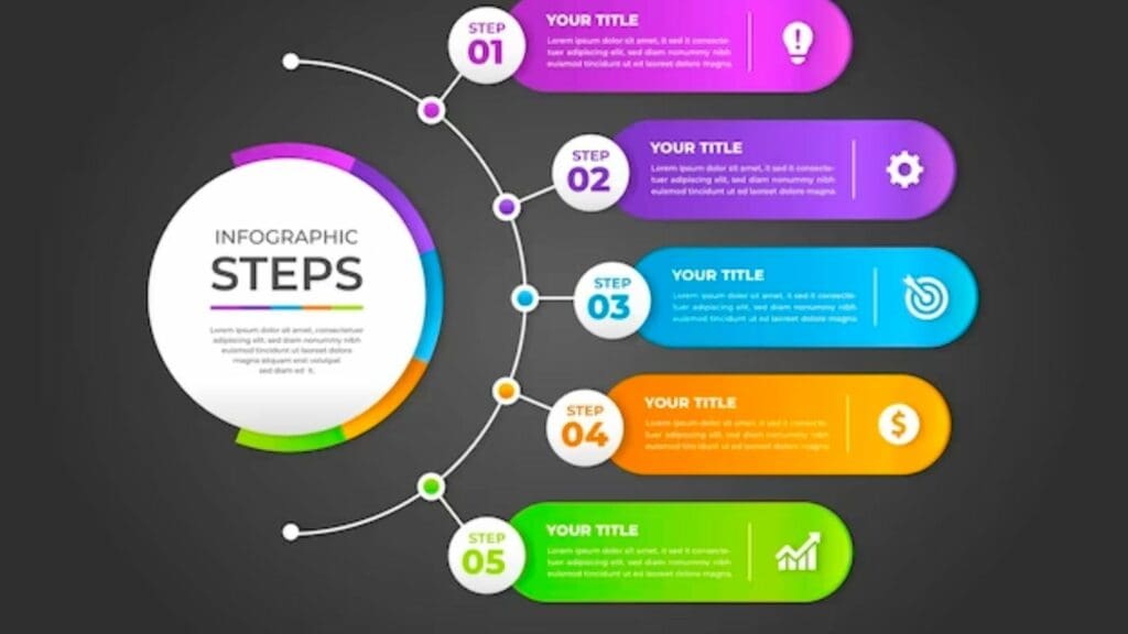

You will also like to pay attention to adding labels, categories, subcategories, and all that is relevant.
But don’t forget to add a conclusion or Call To Action button in that infographic. This way, you can perfectly deliver your message to your intended audience.
4. Make Your Data Easy To Understand
It’s not about putting too much and lengthy information. Instead, it is about putting engaging information.
Instead of longing for content, you can use icons, images, charts, buttons, bullets, etc. to make your users visualize your data in a better way.
Use simple, clear, and easy vocabulary. In the meantime, don’t forget to add more data visualization techniques.
These include grouping, sorting, highlighting, and filtering to increase your visitor’s focus only on the information that matters the most.
5. Create a Story, Not Some Random Posting
People are more interested in hearing what you have to say in a story than doing one infographic post and not bothering for months.
Therefore, keep your audience engaged with a series of short infographics where you share solutions, stories, brand awareness, and the latest trends. Or information on how your products and services will improve people’s lives.
Moreover, adding a call-to-action button that influences the readers to do more is always recommended in completing your entire struggle for visualizing data for infographics.
At last, these are some useful things to consider when it comes to visualizing your infographics data. Not only does it help you engage with your users. But it also increases your conversions to the greatest deal.
Final Takeaways:
Data visualization is not a few steps. Instead, it’s a long-form practice that companies and brands keep doing from time to time. They do everything in their capacity to share their message with their targeted audience. And even if they have to change their strategy like a hundred times, they are willing to do it. That’s because understanding what our user wants really matters. And what matters the most is how we provide it to him.







Leave a Reply
View Comments